Common Logo Design Mistakes That Hurt Brand Credibility
Most logo mistakes are easy to avoid once you know what to look for. The most common ones are trendy effects, clip art, too many colors, and designs that fail in one color or at small sizes. This guide covers the common logo design mistakes that make a business look amateur, with a quick fix for each one.
Logo ideas from the BuildMyLogo logo maker

1. Following trends that will date quickly
Gradients, drop shadows, glossy effects, and ultra-thin lines were popular in past years and look dated now. A trend-driven logo may look fresh at launch, then feel old within two or three years. Fix it: use solid shapes and classic proportions. If you want a modern feel, use clean spacing and a simple sans-serif font.
2. Using clip art or stock icons
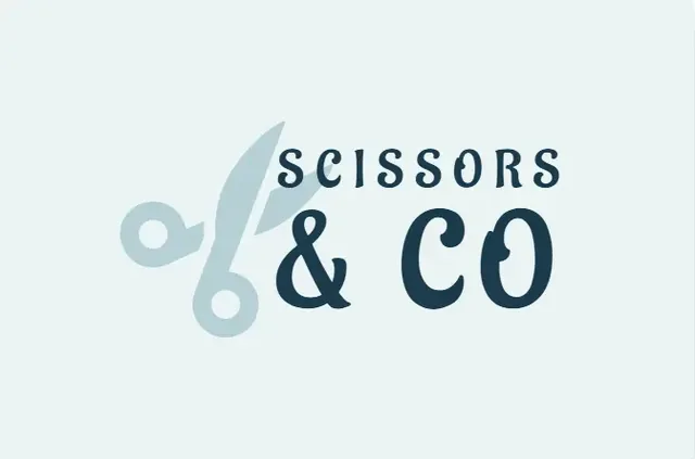
A generic house, a stock lightbulb, or a default gear icon tells customers nothing about your business. It also makes your logo hard to protect, because many other businesses use the same image. Fix it: combine a simple shape with a detail that is specific to you, such as a local landmark, a product feature, or your first initial.
3. Using too many colors
Four or five colors look busy and cost more to print. Embroidery and screen printing charge per color. Fix it: limit the logo to one or two colors plus a neutral. Read our color psychology guide to choose a strong palette.
4. Designing only in color
Many logos look fine in color and fail in black and white. Newspapers, fax copies, engraved plaques, and single-color stamps all need a logo that still works. Fix it: convert your logo to grayscale before you finish. If the shape disappears, simplify it.
5. Using text that is too small or too thin
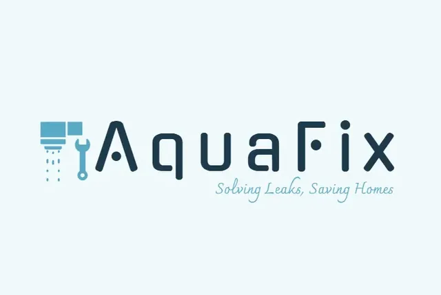
A detailed script or a hairline font may look elegant on a large screen but fails on a phone, a favicon, or a van seen from the road. Fix it: test the logo at 16 pixels and at the size of a business card. If the name is hard to read at either size, choose a heavier font. Our logo typography guide explains which fonts hold up.
6. Adding details that disappear
Tiny leaves, thin outlines, and fine patterns look impressive in a large mockup but turn into noise at small sizes. Fix it: remove any detail you would not notice at 32 pixels. Keep the mark bold and clear.
7. Choosing a name that does not work as a logo
Very long names, names with many similar letters, and names that need a long explanation are hard to turn into a logo. Fix it: plan a short version for small spaces. Many businesses use a monogram or the first letters for the app icon and the full name for signs.
8. Skipping the file formats
A logo saved only as a JPG with a white background will look wrong on a colored website, a dark app, or a printed sign. Fix it: download a transparent PNG for the web and an SVG for print. Our logo file formats guide explains each one.
9. Copying a competitor
A logo that looks too much like another brand can cause legal trouble and confuse customers. Before you finalize your design, search for your concept on Google Images and check the trademark database in your country. Fix it: change the shape, layout, or colors enough that your logo stands on its own.
A quick logo mistake checklist
- Does it avoid trends that will date within two years?
- Is it an original idea, not a stock icon?
- Does it use two colors or fewer?
- Does it work in black and white?
- Is it readable at 16 pixels?
- Do you have a transparent PNG and an SVG?
Avoid these mistakes with a clear process
Use the checklist above on every version you consider. Then review your shortlist against our logo design principles. To compare fresh options quickly, create logo ideas free on BuildMyLogo and run each one through the checklist before you choose.
FAQ
What is the most common logo design mistake?
Following trends that date quickly, such as heavy gradients and thin hairlines. Simple solid shapes stay current longer.
Why does my logo look bad on a business card?
It usually has too much detail, too many colors or text that is too thin. Simplify the mark and test it in one color at small size.
Can I use clip art in my logo?
It is risky. Stock icons look generic, are hard to protect, and are used by many other businesses. Add a unique detail to any common shape.
How do I check my logo for trademark problems?
Search your logo idea on Google Images and check your country's trademark database before you print or register the design.
Ready to Create Your Logo?
Generate logo ideas for your business name and download your favorite when you are ready.
Create Your Logo FreeKeep Reading
How to Create a Logo Online for Free (Step-by-Step Guide)
Create a logo online for free in under an hour. Follow 6 simple steps, check your logo at small sizes, and download the right files.
Logo Fonts: How to Choose and Pair Typography for Your Brand
Choose the best logo fonts for your brand. Compare serif, sans-serif, script and display type, and learn how to pair two fonts well.

10 Logo Design Tips for Small Businesses
10 practical logo design tips for small businesses: keep it simple, choose colors on purpose, make it scalable and save the right files.