Fitness and Gym Logo Design: Brands That Inspire Action
A gym logo should tell people what kind of training they will get before they walk in. High-intensity gyms usually use bold type, strong contrast, and sharp shapes. Wellness studios use softer colors and rounder forms. This guide covers gym logo ideas, fitness logo design, and how to choose between an intense look and a calm one.
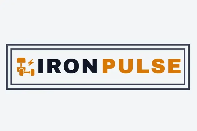
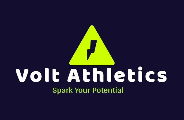
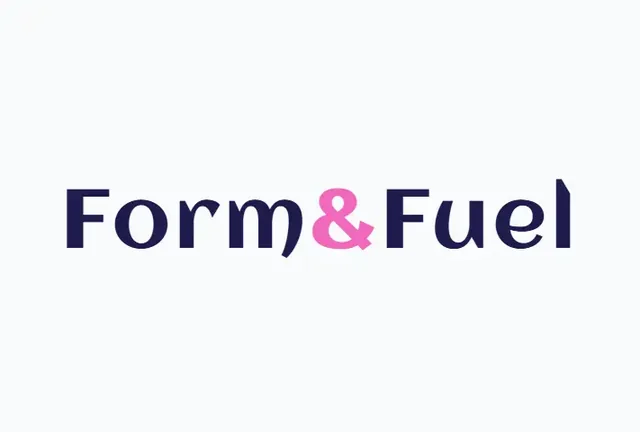
Fitness logo ideas from BuildMyLogo
Gym logo styles: intense or calm?
| Direction | Colors | Shapes and type | Best for |
|---|---|---|---|
| High-intensity | Black, red, orange, neon accents | Heavy sans-serif, angular shapes, shields | CrossFit, boxing, strength gyms |
| Community | Blue, green, warm yellow | Rounded badges, friendly type | Local gyms, group classes, family fitness |
| Premium | Black, gold, white | Clean serif or sharp sans-serif | Boutique studios, luxury clubs |
| Wellness | Soft green, cream, lavender | Thin sans-serif, organic shapes | Yoga, pilates, mindfulness studios |
Gym logo icons that work
- Monogram or letter mark: one strong letter in a shape. Works on apparel and social avatars.
- Abstract movement: a stylized arc, arrow, or bolt suggests motion without showing equipment.
- Shield or badge: communicates strength, protection, and membership.
- Literal equipment: dumbbells and kettlebells are clear, but very common. Pair them with a unique letterform.
Gym logo design tips
- Pick the training style first. The logo should match what members do, not only what looks cool.
- Use heavy type for the name. Gym signs are read from a distance and while people walk past.
- Check the logo on apparel. If you plan embroidered polos or hoodies, use flat colors. Threads cannot stitch a fade or a soft gradient.
- Design a short version. Use initials or a symbol for the app icon, a water bottle, and social avatars.
- Avoid overused gym cliches. Lightning bolts and generic flexed arms are everywhere. Add a distinctive detail.
Wellness studio logo ideas
Yoga, pilates, and wellness brands win with calm, breathable design. Use soft colors, lots of empty space, and simple line work. A leaf, a sun, or an open circle suggests balance. Keep the type light, but test it at small size so the name stays readable on a phone.
Logo mistakes that hurt gym brands
- Using a neon palette on a logo that will also be printed in one color.
- Mixing an aggressive icon with a soft script font, which sends mixed signals.
- Copying the popular bold-letter look so closely that you blend in.
Get your gym logo started
Decide between intense and calm, pick one icon idea, and test the name on a shirt and a sign. See fitness logo ideas on BuildMyLogo and generate a set of options for your gym or studio free.
FAQ
What colors work best for a gym logo?
Black, red and orange suit high-intensity gyms. Blue and green suit community studios, and soft green or cream suits wellness.
Should a gym logo include dumbbells?
A dumbbell is clear but very common. Pair it with a unique letter or shape so the logo stands out.
What font should a gym logo use?
Heavy sans-serif fonts work well for strength gyms, because they read from a distance. Thin fonts suit wellness studios but need testing at small sizes.
Will my gym logo work on apparel?
Yes, if you use flat colors. Embroidery and screen printing cannot reproduce soft gradients or fades.
Ready to Create Your Logo?
Generate logo ideas for your business name and download your favorite when you are ready.
Get Fitness LogosKeep Reading

Tech Startup Logo Design: Ideas and Tips for SaaS Brands
Tech startup logo design tips: geometric marks, favicon and app-icon testing, dark-mode versions and the vector files you need.
Barbershop Logo Ideas That Work on Signs and Instagram
Barbershop logo ideas that work on hanging signs, mirror decals and Instagram. Colors, fonts, icons and the files barber shops need.
Clothing Brand Logo Ideas and Streetwear Logo Design
Clothing and streetwear logo ideas for tees, hoodies and hang tags. Wordmarks vs badges, print-safe colors and the files your merch printer needs.